Square Holes
Corporate Rebrand Design

Rebranding a Market Research Agency
A corporate rebrand is an opportunity to redefine perceptions, communicate a new vision and claim new market positioning. It is a way to more genuinely reflect the current personality and ethos of a brand – both inwardly and outwardly.
Square Holes is a well established and trusted marketing research agency based in South Australia. Celebrating 18 years in business was a milestone providing the perfect opportunity to reconnect with their audience and show the world they had matured and come of age as a true global player.

Brand Identity Logo Design
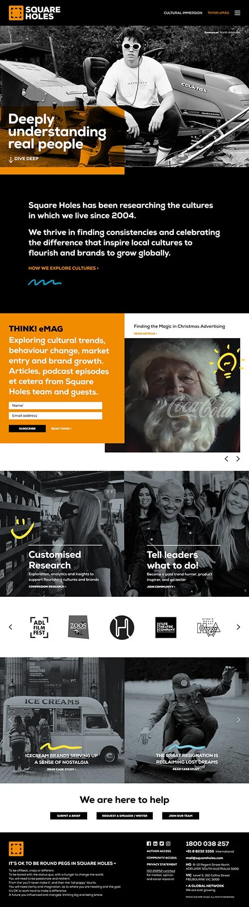
After 18 years, it was time to move Square Holes forward with a more mature and established brand style to help reposition them as a modern, global leader.
Changing the youthful look of the previous logo to a more structured typeface set in upper case created a sense of increased authority, confidence and expertise. The word mark is paired with a newly designed brand icon, symbolic of focusing in on a subject – reflective of the research agency’s core service offering.

Brand Positioning
As part of Square Holes’ rebrand, we refined the brand positioning statement to create a more tightly focused tag line that would stick in people’s minds and reflect their core differentiator. For Square Holes, research is not just about data – their aim is to help their clients deeply understand real people.

Website Design Direction
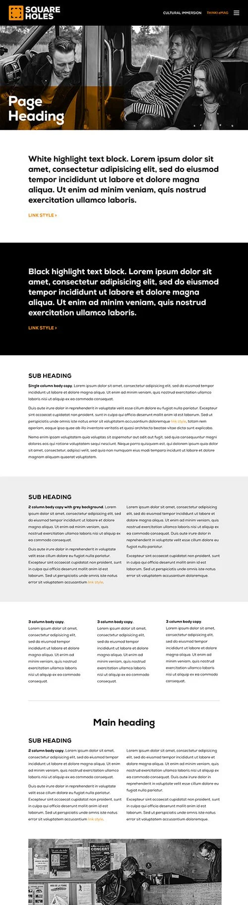
After nearly two decades, Square Holes’ website was deep and content heavy. The challenge was to retain this vast library of information, while presenting it in a way that reflected the new brand styling, allowed easy navigation and a high degree of legibility.
Design Direction was provided as a visual style guide. Example web page designs containing generic content blocks acted as a reference to allow Square Holes’ web developers to build an entire website with a consistent brand look & feel.
Once the full website was constructed, a Design Audit was carried out with feedback and creative direction provided to ensure the original design vision was achieved and the overarching brand style adhered to.


Business Card Design
Square Holes’ new business cards leave a strong first impression. Printed with opaque inks on matte black card stock, they feature QR codes to take the viewer directly to the individual’s own content on the Square Holes website.
“Hello, pleased to meet you!”
Go on, you know you want to scan one 😉

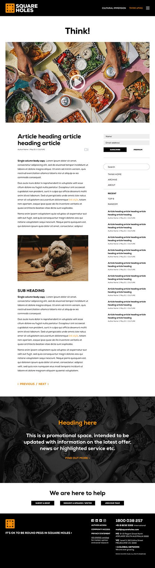
Think! Email Newsletter Design
Think! eMag is Square Holes’ weekly newsletter, packed with all things cultural immersion, brands and real people – written for curious decision makers.
The eMag was designed as a Campaign Monitor® template, ready for Square Holes’ team to simply update with fresh content and email out to their eagerly awaiting subscribers every Friday. Subscribe below to get your copy.


“We have always had global aspirations for our brand, and this new brand identity is a clear indication that those aspirations are being realised,”
– Jason Dunstone, Founder / MD, Square Holes
Creative Direction
Graphic Design
Copywriting
Print Management
CLIENT
Square Holes
Adeaide, South Australia
OTHER CASE STUDIES