The Matador
Wine Packaging Design
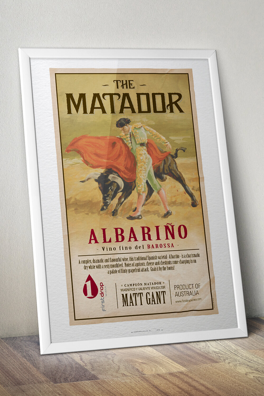
A wine label to grab by the horns!
To celebrate the wine’s Spanish grape varietal, Albariño, The Matador’s label design takes the form of a vintage Spanish bullfighting poster.
An original illustration was hand-painted using gouache on canvas board, then complimented with custom digital typography. Tasting notes were written as tongue-in-cheek 'Spanglish', while the back label design made reference to modern-day bullfight tickets. Small details, such as the illusion of a folded corner, further added to the authentic vintage feel. Olé!

“It’s the best ersatz Spanish label since Karl Seppelt AO did the bulldust thing with his Bullamakanka in the ’70’s.”
— Philip White, The Advertiser

“‘Wow’ was my initial reaction. Absolutely nailed the design based on the brief.”
— Matt Gant, Winemaker, First Drop Wines
Creative Direction
Graphic Design
Illustration
Copy Writing
Print Management
CLIENT
First Drop Wines
Barossa Valley, South Australia
AWARDS
Bronze – PICA Awards
Photography © asbCreative